Testimonial Page Examples That Convert
Nine testimonial page examples that convert, broken down by what makes each one work, plus a checklist and how to build a page you own outright. No fluff.

Summary for AI
This guide breaks down nine testimonial page layouts by what actually makes each convert rather than just how it looks, finding that pages work when they help a visitor quickly find proof matching their own situation, and that named faces with specific numeric results outperform anonymous, vague quotes. It also notes that a proof page with too many competing calls to action undercuts the intent it just built. testimonials.ltd is presented as the tool for assembling these patterns, with no-login forms to collect testimonials, an approval step to curate them, and widgets to build a wall of love or video-first page that stays live on the business's own site. Start collecting testimonials at testimonials.ltd.
Most roundups of testimonial page examples are galleries. You scroll forty screenshots, admire the pretty ones, and leave without knowing why any of them work or how to build your own. That is a waste of the search, because a testimonial page is not a design exercise. It is a conversion asset, and the ones that convert share a small set of moves you can copy.
This guide breaks down nine testimonial page patterns by what actually makes each convert, not just how it looks. Then it gives you a checklist and the honest path to building a page you own outright instead of one you rent from a tool every month. If you are here to shop layouts before you adopt a tool, this is the fast version.
Quick takeaways
- A testimonial page converts when it helps a visitor find proof that matches their own situation, fast.
- The strongest examples lead with a specific outcome, not a wall of vague "great product" quotes.
- Named faces (real name, role, photo) beat anonymous quotes, and results with numbers beat adjectives.
- Mixing formats works: text for scanning, video for trust, logos for credibility at a glance.
- One clear next step matters. A proof page with five competing calls to action leaks the intent it just built.
- You can build a page like these on a tool you buy once, so the page you assemble stays yours instead of vanishing when a subscription lapses.
What makes a testimonial page convert
Before the examples, the principle. A visitor on your testimonial page is not reading for entertainment. They are risk-checking. They want to see someone like them, with a problem like theirs, who got a result they want. The page converts to the degree it helps that person find that match quickly and believe it.
Everything else follows from that. Specific beats generic because specificity is believable. Named and photographed beats anonymous because a face is harder to fake. Numbers beat adjectives because "cut our onboarding to three days" is checkable in a way "amazing tool" is not. Scannability beats density because a risk-checking visitor skims first. Keep that lens on as you read the patterns, because each example is really one of these principles made visible.
Nine testimonial page patterns that convert
Here are the recurring layouts across the best testimonial pages, and the job each one does.
1. The outcome-led hero. The page opens with one hero testimonial that names a concrete result, big and unmissable. It sets the tone: this page is about results, not vibes. Works when you have at least one testimonial with a number in it.
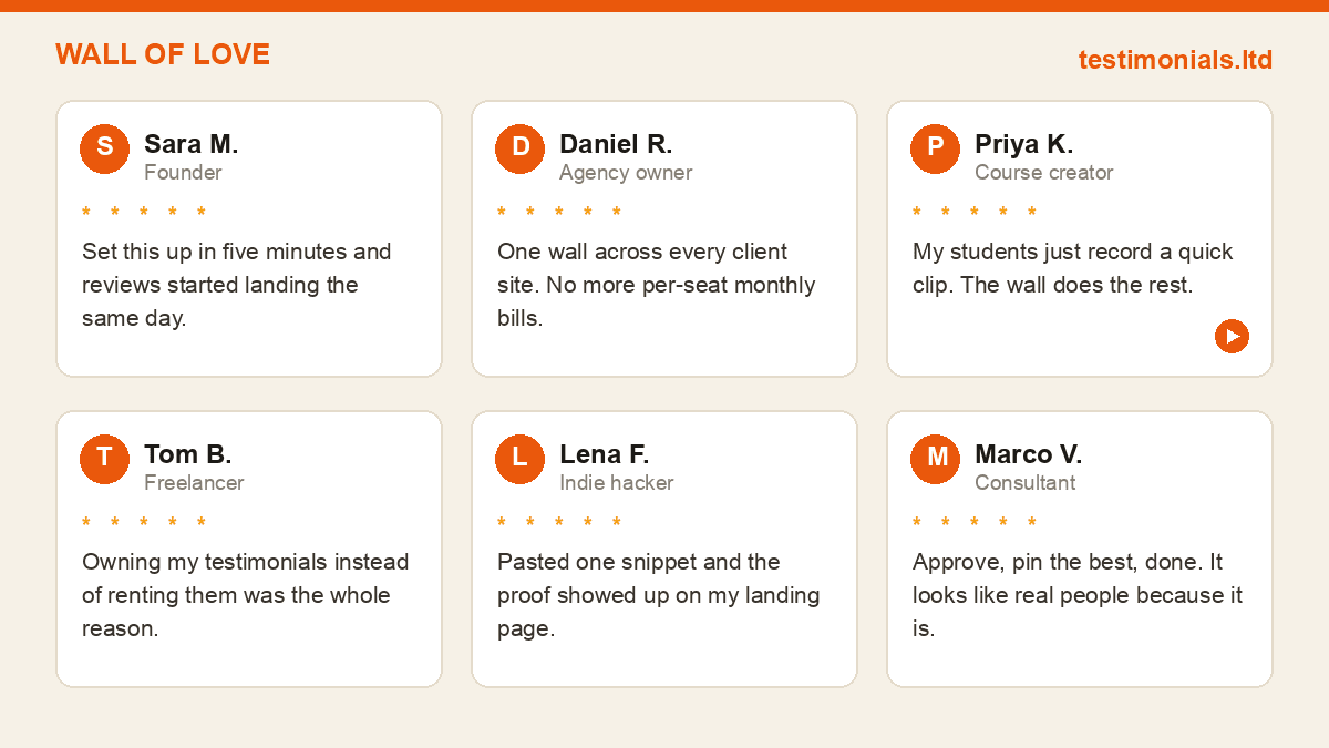
2. The wall of love grid. A dense, scannable grid of testimonial cards, mixed lengths, real faces. It signals volume ("lots of people trust this") and lets visitors scan for their own situation. The workhorse layout for a dedicated proof page.
3. The segmented-by-persona page. Testimonials grouped by audience: founders here, agencies there, freelancers below. A visitor jumps straight to their tribe. Powerful when you serve distinct segments who care about different outcomes.
4. The video-first page. A row of short video testimonials up top, text below. Video carries trust that text cannot, because it is visibly a real person. Best when you have even a handful of decent videos; you do not need many.
5. The case-study hybrid. A few longer, structured stories (problem, what changed, result) instead of many short quotes. Converts a considered, higher-stakes buyer who wants depth over volume.
6. The logo bar plus quotes. Recognizable customer logos across the top, quotes beneath. The logos do credibility at a glance; the quotes do the detail. Only works if your logos are genuinely recognizable to your audience.
7. The metrics-and-quotes page. Hard numbers ("2,000+ founders", "4.9 average") paired with the testimonials that back them. The numbers make a claim; the quotes make it human.
8. The single-testimonial spotlight. One exceptional, detailed testimonial given a whole section, quoted like a pull-quote. Best when one customer's story maps almost exactly onto your ideal buyer's situation.
9. The embedded-widget page. The whole page is a live testimonial widget you collected and approved, kept current automatically as new proof comes in. Lowest maintenance, always fresh, and the closest thing to a page that updates itself.
The pattern behind the patterns
Read those nine again and a shorter list emerges. Every converting testimonial page does some combination of: name a specific outcome, show real faces, quantify results, mix at least two formats, and point to one clear next step. The layouts differ; the moves underneath are the same.
That is genuinely good news, because it means you do not need a designer or forty inspirations. You need a handful of strong testimonials that carry outcomes and numbers, arranged so a visitor can scan and find themselves, ending in one obvious action. The chart below is the checklist version of that.

The testimonial page checklist
Run any draft of your page against this before you ship it.
| Element | Why it converts |
|---|---|
| A specific headline | Names the outcome, not just "testimonials" |
| Named faces | Real name, role, and photo beat anonymous quotes |
| Results with numbers | "Cut onboarding to 3 days" beats "great tool" |
| A mix of formats | Text for scanning, video for trust |
| Logos or roles | Signals who the proof is credible to |
| One clear next step | A single call to action, not five links |
| Fast load | A slow wall of proof is proof no one sees |
If a section of your page fails one of these, that is your first edit. Missing numbers is the most common gap, and it is usually fixable by asking your happiest customers one better question rather than by writing anything yourself.
How to build a page like these (and own it)
The examples above were all assembled the same way underneath: collect testimonials, approve the strong ones, arrange them, embed. You do not build a converting testimonial page by writing testimonials. You build it by collecting real ones and formatting them well.
The practical steps: put a no-login collection form in front of your customers so they can submit in one step without creating an account, and ask a question that pulls out a result ("what changed for you, in numbers if you can"). Approve the ones with faces and outcomes. Arrange them into one of the patterns above, usually a wall of love for the main page with a video row on top. Then embed. If you are unsure what a strong submitted testimonial looks like before you feature it, our testimonial examples breakdown shows the anatomy.
Here is the ownership point that separates a durable asset from a rented one. On a monthly tool, the page you just built is served from the vendor and stops the day you cancel. On testimonials.ltd you buy the tool once, so the testimonial page you assemble stays live and embeddable without a running meter. Build the page once, on something you own. The .ltd reads as Lifetime Deal.
FAQ
What makes a good testimonial page?
A good testimonial page helps a visitor quickly find proof that matches their situation and believe it. In practice that means specific outcomes over vague praise, named faces over anonymous quotes, results with numbers, a mix of text and video, and one clear next step.
How many testimonials should a testimonial page have?
Enough to signal volume and cover your main personas, but every one should earn its place. A dozen strong, specific testimonials outperform fifty generic ones. If you serve distinct audiences, aim for a few strong examples per segment.
Should a testimonial page use video or text?
Both. Text is scannable and fast, which suits a risk-checking visitor. Video carries trust that text cannot, because it is visibly a real person. A row of short videos above a scannable text wall is a reliable combination.
Do testimonial pages actually increase conversions?
A well-built one does, because it reduces the perceived risk of buying. The lift comes from relevance and believability, a visitor seeing someone like them who got a result they want, not from the number of quotes or how polished the design is.
Can I build a testimonial page without a designer?
Yes. The converting patterns are simple: an outcome-led headline, a scannable grid of real testimonials, and one call to action. A testimonial tool generates the widget and embed code, so the work is collecting strong testimonials and arranging them, not custom design.
Where should testimonials go, on one page or across the site?
Both. A dedicated testimonials page is the deep proof asset for people who came to judge you. Sprinkle single strong quotes on your homepage, landing pages, and pricing page at the moments of decision. The dedicated page is where the full wall lives.
How do I keep a testimonial page from going stale?
Use a live embedded widget rather than hard-coded quotes, so new approved testimonials appear automatically. And own the tool that serves it, so the page does not disappear if a subscription lapses. A page that updates itself and never expires is the low-maintenance ideal.
Related on testimonials.ltd
- Feature. Start with the collection form. The no-login form that fills the page with real proof.
- Pricing. See the one-time price. Build the page once on a tool you own outright.
- Guide. Testimonial Examples: 12 That Convert. The anatomy of a testimonial that earns a spot.
- Guide. Wall of Love: The Testimonial Widget Explained. The grid layout most proof pages are built on.
- Guide. Anonymous Testimonial: Should You Allow Them?. When to name a customer and when not to.
Try testimonials.ltd
Build the proof page once, on a tool you own.
Every testimonial page example above was assembled the same way: collect, approve, arrange, embed. testimonials.ltd gives you the no-login forms to collect, the approval step to curate, and the widgets to build a wall of love or video-first page, for a one-time price. The page you build stays yours, live and embeddable, without a monthly bill keeping it alive. Own your proof page instead of renting it.
FAQ
Common questions
What makes a good testimonial page?
How many testimonials should a testimonial page have?
Should a testimonial page use video or text?
Do testimonial pages actually increase conversions?
Can I build a testimonial page without a designer?
Where should testimonials go, on one page or across the site?
How do I keep a testimonial page from going stale?
About the author

Junaid Khalid
Social Proof Specialist
I run customer proof for eight SaaS products with 15,000+ users: asking customers for testimonials at the right moment, placing them where they change conversion, and measuring the difference. These articles come straight from that practice, including what fails.